Life - The Type
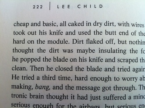
As a closet typography nerd, it's always fun to learn about a new typeface. Or, in this case, a new-to-me typeface. I'm enjoying the trend that's shown up in book publishing the last few years where the reader is informed what type the book is set in. Yesterday I finished Lee Child's latest Jack Reacher novel, Worth Dying For, and at the end we're introduced to the type of Life:
"The text of this book was set in Life, a typeface designed by W. Bilz, and jointly developed by Ludwig & Mayer and Francesco Simoncini 1965. This contemporary design is in the transitional style of the eighteenth century. Life is a versatile text face and is a registered trademark of Simoncini S.A." Here is how it looks in the book:
A version of Life can be can be purchased from Veer.

